11 Main E-Commerce / Alibaba
UX, CREATIVE DIRECTION, BRAND DESIGN

E-COMMERCE FROM SCRATCH
Looking to enter into the US e-commerce market, Alibaba sought to create a boutique marketplace that provided shops the ability to present themselves to consumers in a well designed and beautiful e-commerce platform. We designed the Brand, an innovative responsive website, 3 native apps and an integrated content marketing strategy to bring consumers to the site. It was an amazing experience to be part of something from the very beginning.
The majority of e-commerce platforms don’t allow people the freedom to create a branded store fronts from beyond the basics. The challenge was to create a platform that gave them this ability while maintaining consistency across the site. The guiding principle behind the 11 Main brand was to match shoppers natural human design to express themselves with the items they choose to purchase and shop owners desire to create a branded online shopping experience that does the same. 11 Main needed to be the fulcrum where shop owner aspirations met shopper aspirations.
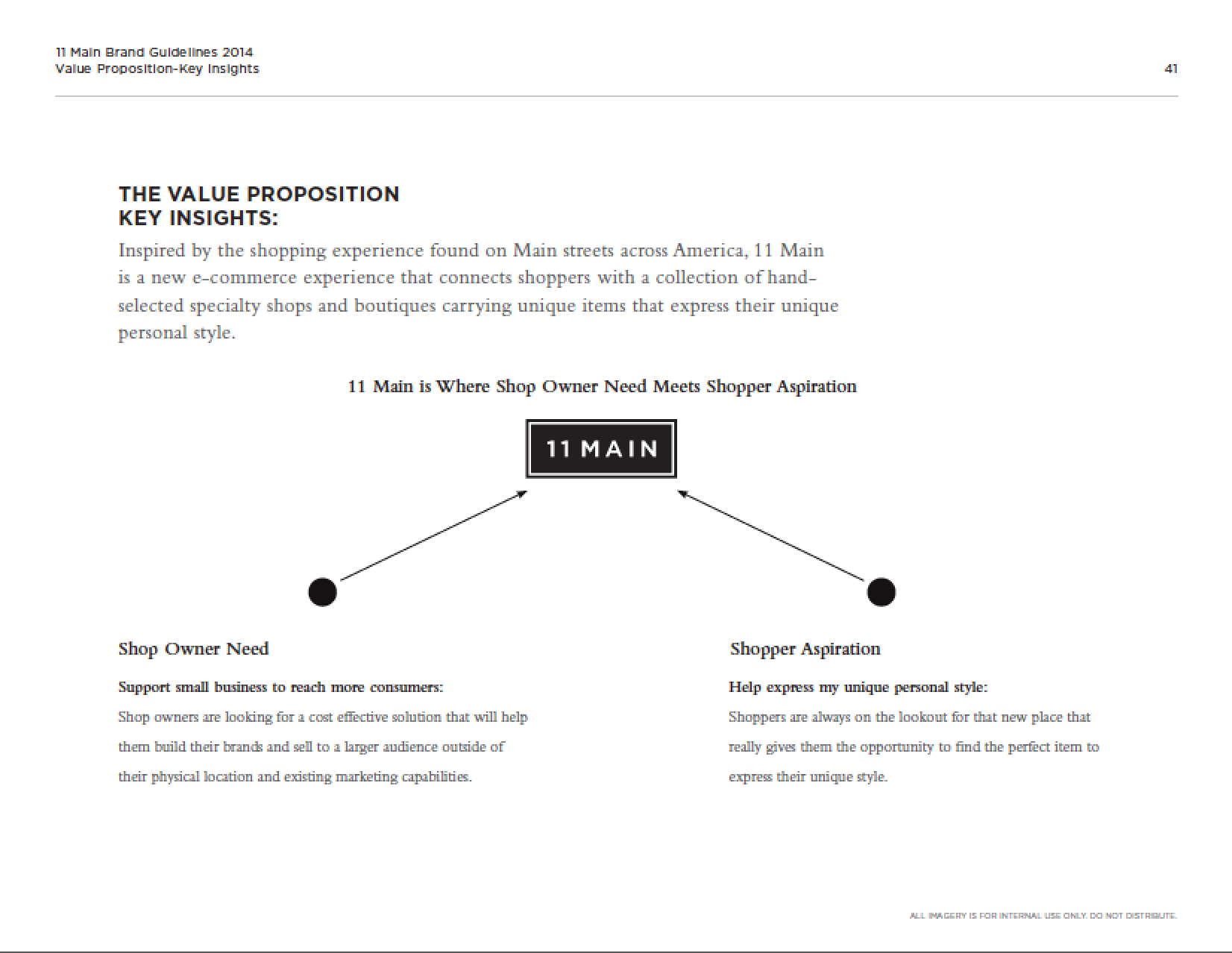
Not everyone is a designer / photographer / videographer. But we are!
Giving people the basic knowledge to help them express themselves is a monumental undertaking. To help shop owners present themselves in an elegant manner we offered them a variety of in depth tutorials ranging from how to photograph their products to what types of photographs help add their personality to the ir shops. Additionally, we created a massive database of images, textures and design elements for them to use if they felt they just couldn’t get there. Serving as an umbrella the 11 Main identity reflected the same basic principles to tie everything together seamlessly.
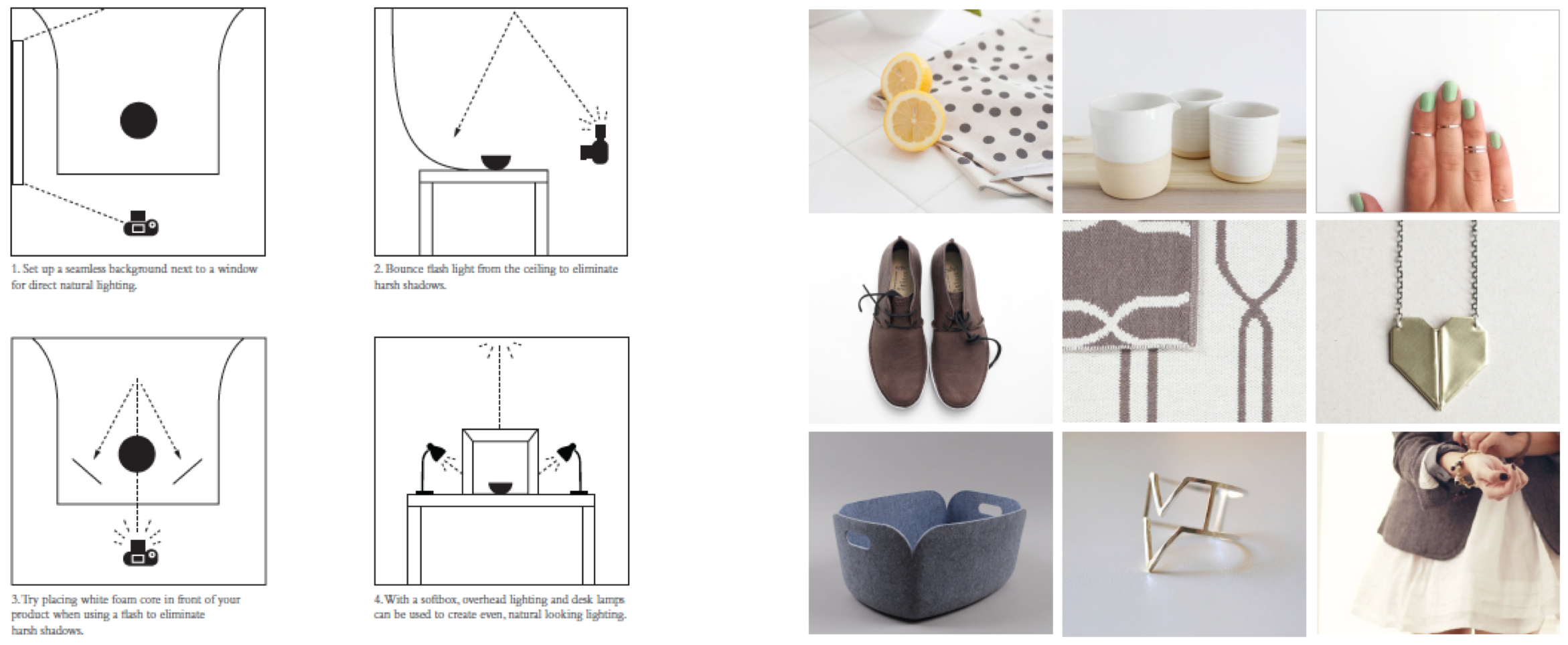
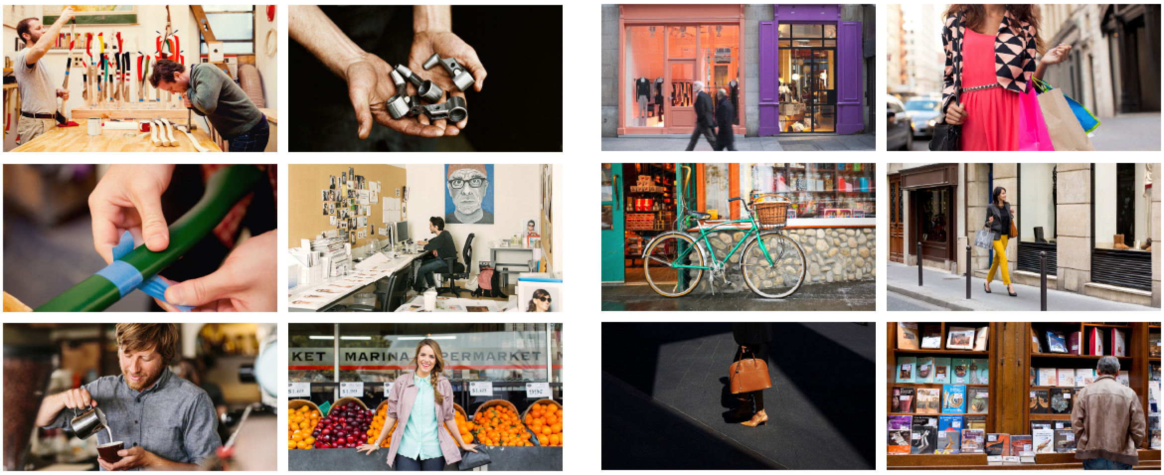
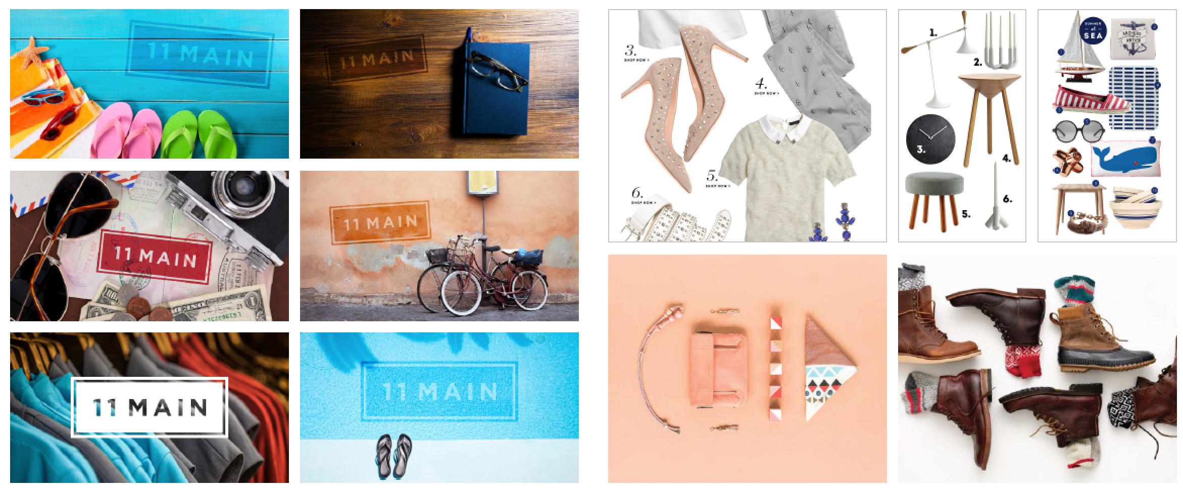
Identity as the foundation for UX.
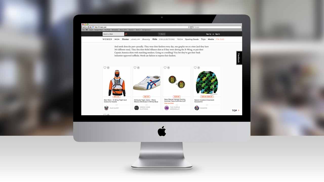
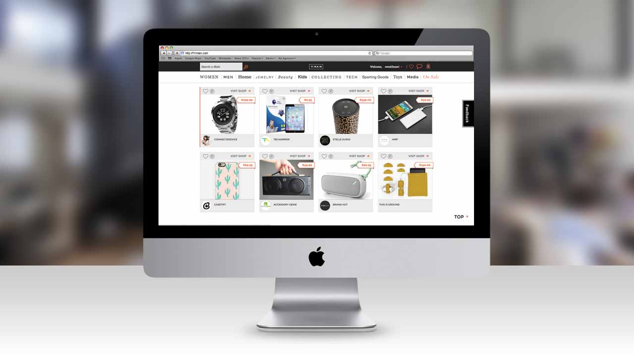
Now for the most important piece to the puzzle. How to introduce our shoppers to the myriad of products on our site in a unique and elegant manner? Easy right? Search / filtering /sort would need to feel natural and follow as simple a taxonomy as possible. For browsing shoppers we created different weekly collections of products based on lifestyle themes. And of course, how we displayed our product would be second to none in terms of elegance and detail. In short, the user experience would need to be based on that same idea of helping shoppers find the products and shops that aligned with their own aspirations.
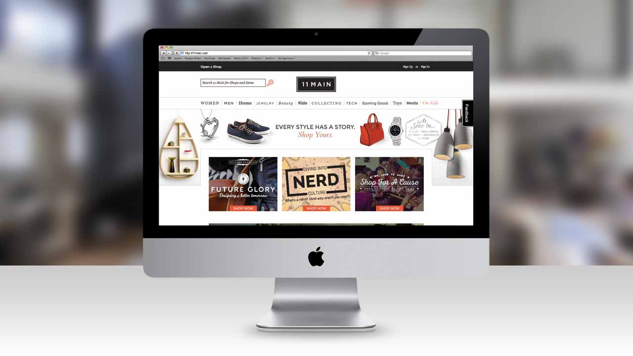
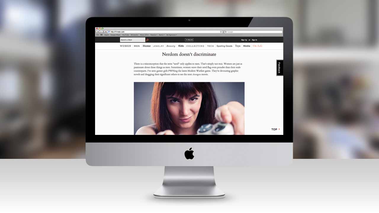
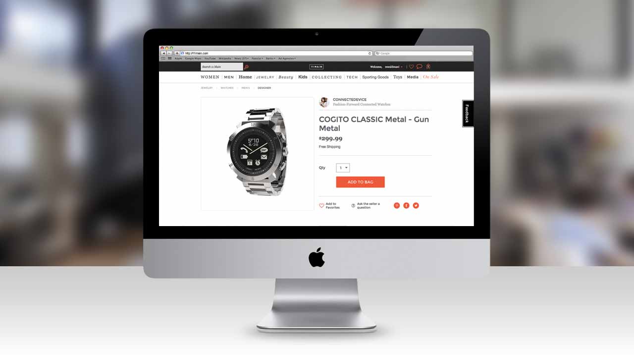
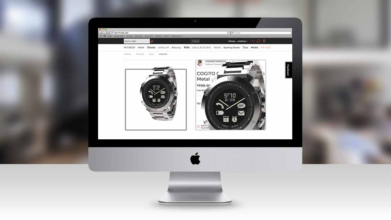
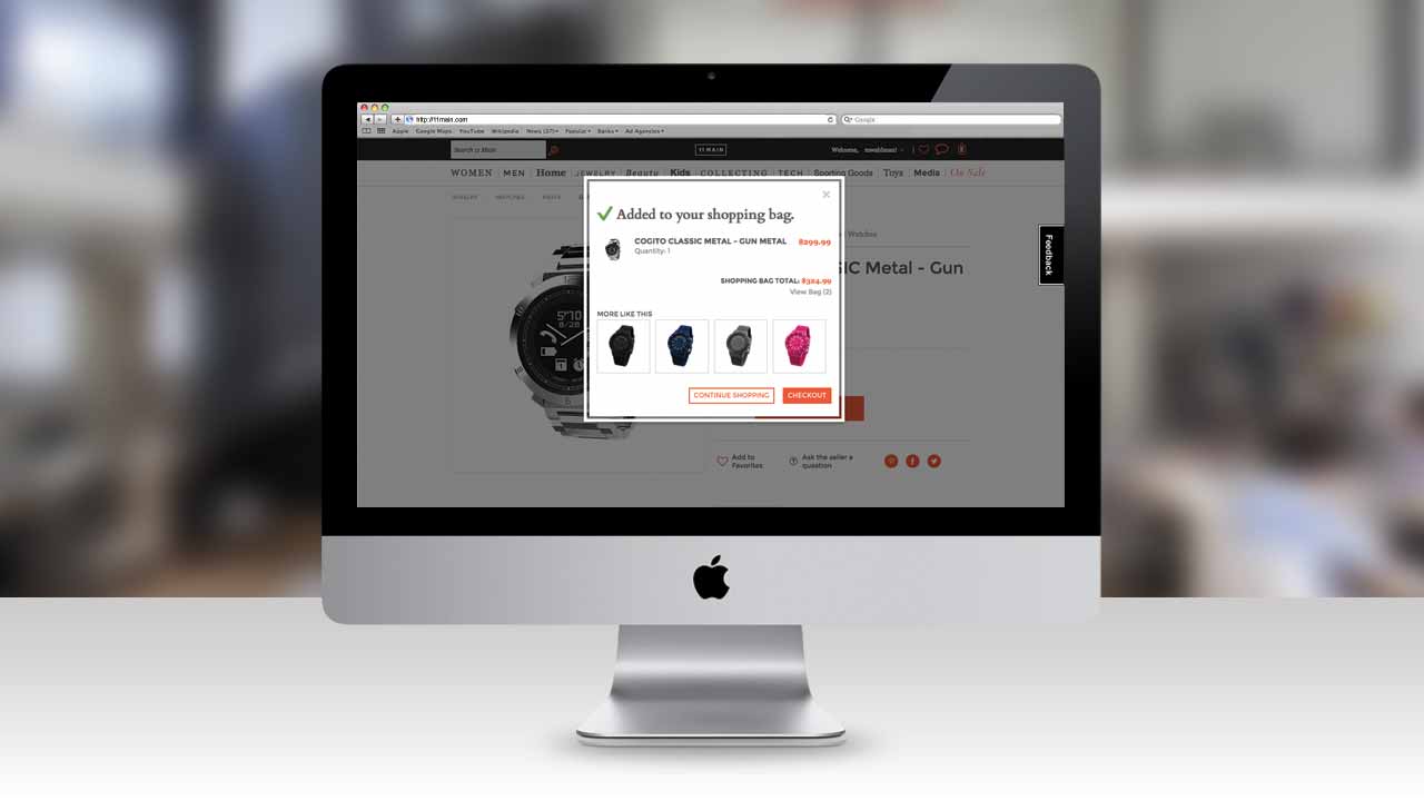
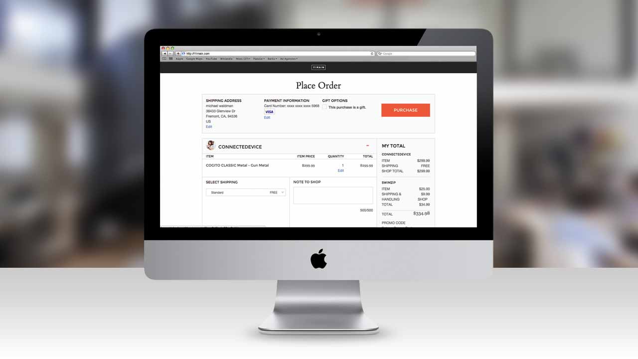
Here’s what the site ended up looking like.
