Design System Governance
UX, Design Systems, Design Process
Atomic Order begets molecular consistency
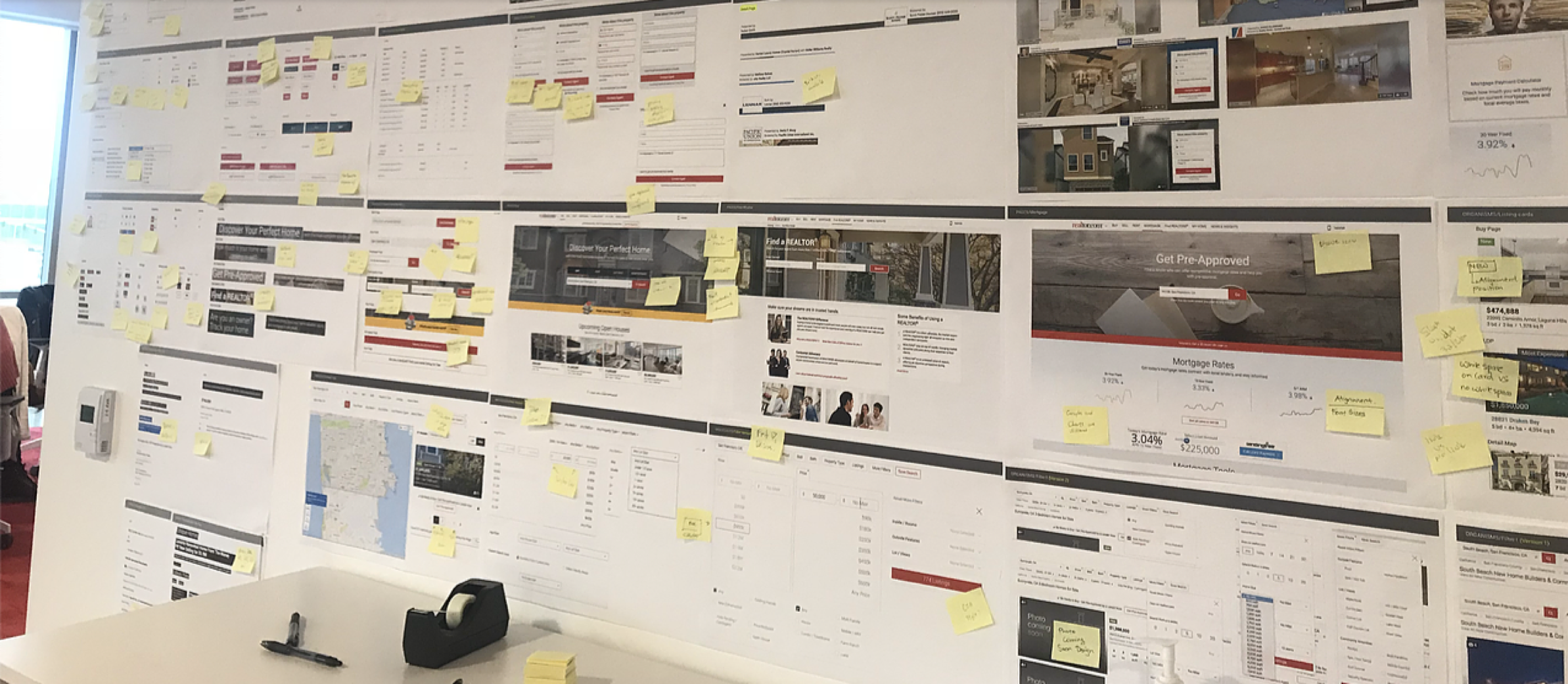
Thorough documentation is the key to a design system that can evolve. The process for creating the Design System at Realtor.com began with strategy. How would we break down our experience into manageable sections that were both logical and searchable for our designers and developers to use successfully? How could we keep everyone informed of the current state of the system? What’s the process for evolving and changing components?
large to small.
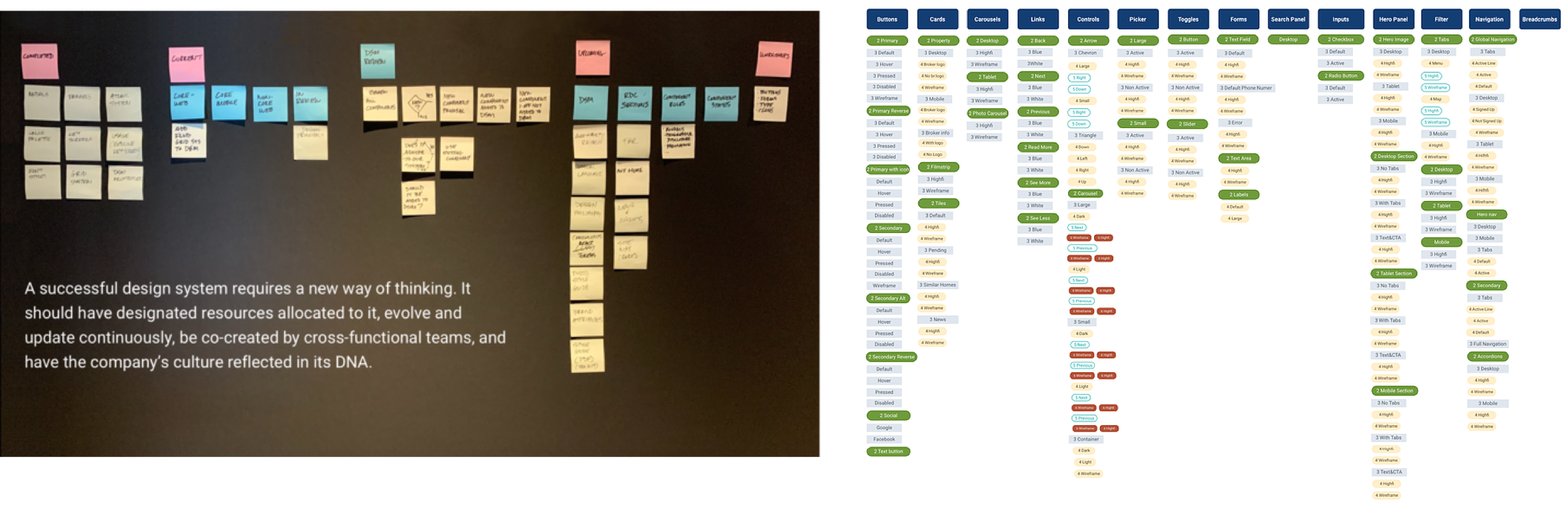
The taxonomy we failed our way into started with large sweeping concepts like Foundations and Framework. The idea was to outline big buckets of structural information to house child subjects like our Experience Principles, grids, governance process for the system, and update cadence. We then separated out large groups of components such as buttons, text styles, controls etc… Finally within each primary group we were able to separate out elements, molecules and atoms in a way that was fairly logical.
Outside of the tool itself documentation is the next most important piece to the system. It’s how designers and developers understand what a component is, how to use it and how to change it if needs be. It’s a single source of truth for the most current state of design.
Governance:
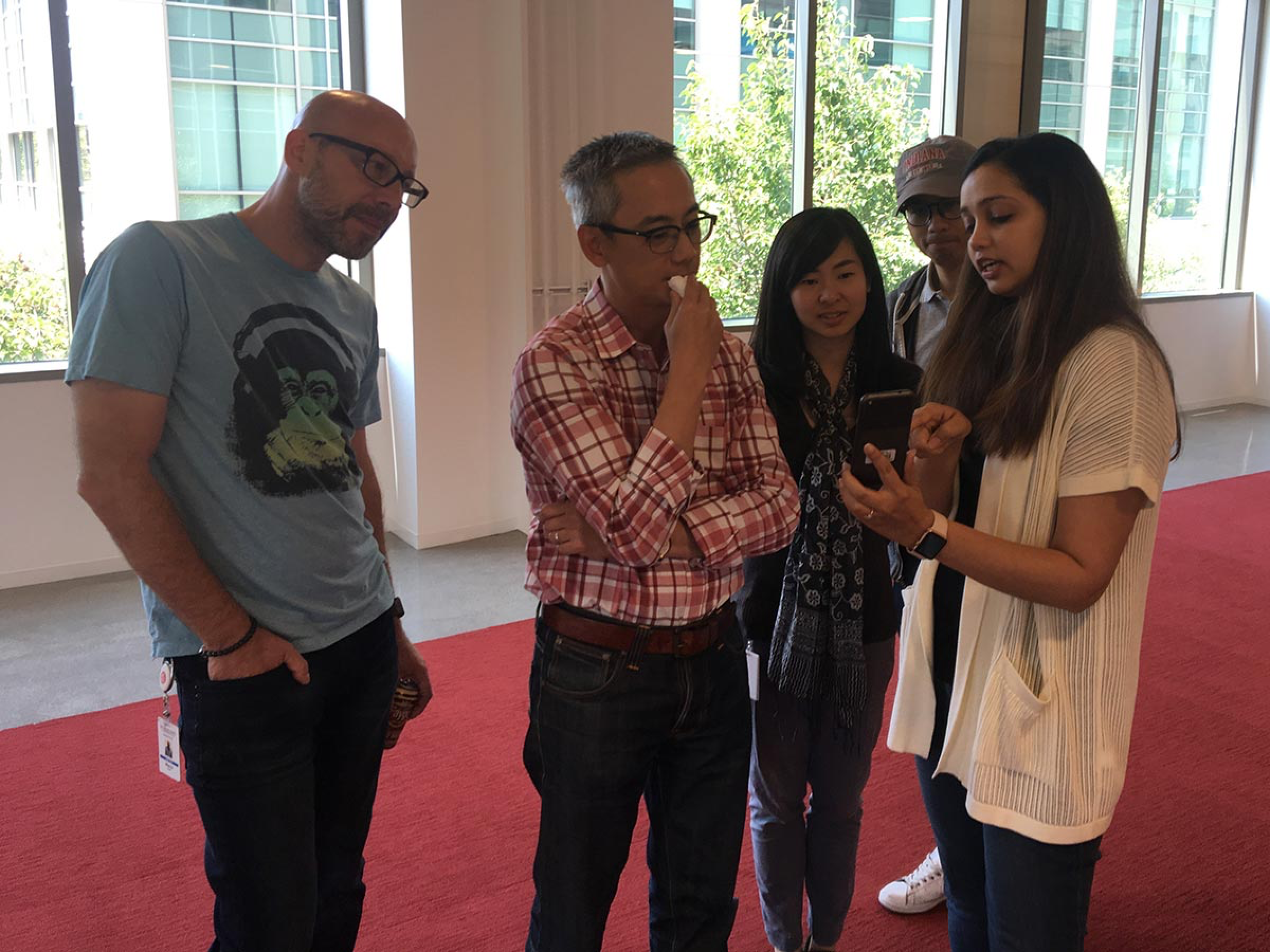
Any system is only as good as the process of governance protecting it from frivolous exceptions. But any system is also only as good as it’s ability to evolve and be flexible. So how does that work? We tried a few different approaches to governing the system itself and finally landed on a process whereby any designer, PM or developer could come to our group office hours and present their needs or feedback. To maintain pace we held office hours three times per week. We soon discovered the main question was what constitutes a new component vs an existing one. To further complicate matters A /B testing needed to play a role in our process serving as a gate for entering a component into the actual library. In the end really good communication between teams was the key. Without it nothing really worked.

Documentation:
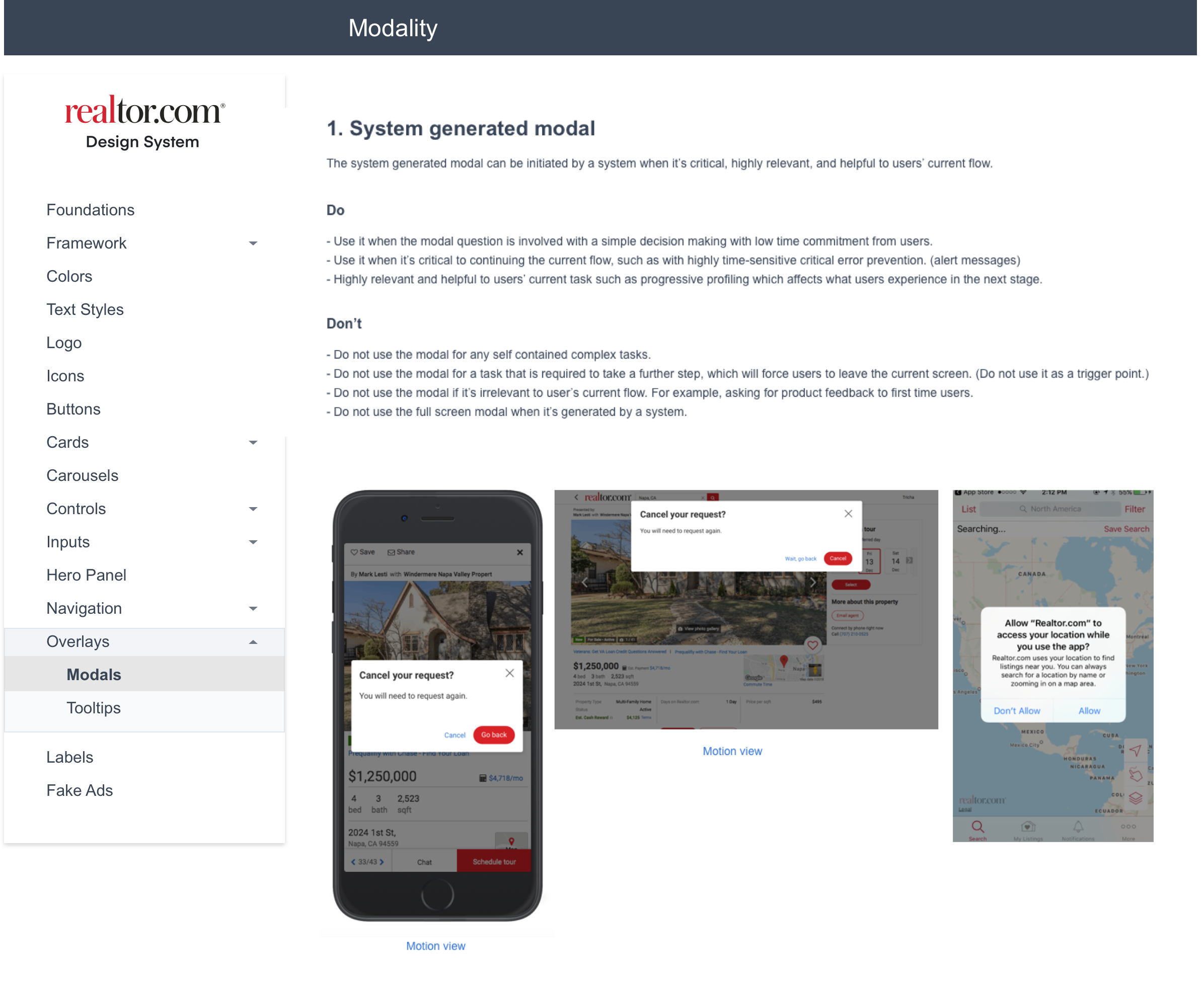
None of the current design system tools like Figma, Abstract, Gatsby, Invision or otherwise, have the ability to both house live components and full documentation for any given component. Because understanding how to use / create a component is such a vital piece of information, we ended up developing a separate website dedicated to documentation for the DSM. We then provided links in the relevant places within the tool. In other words, you would go to icons for basic guidelines but to learn more you would click to a much more robust version of the documentation on the documentation site.
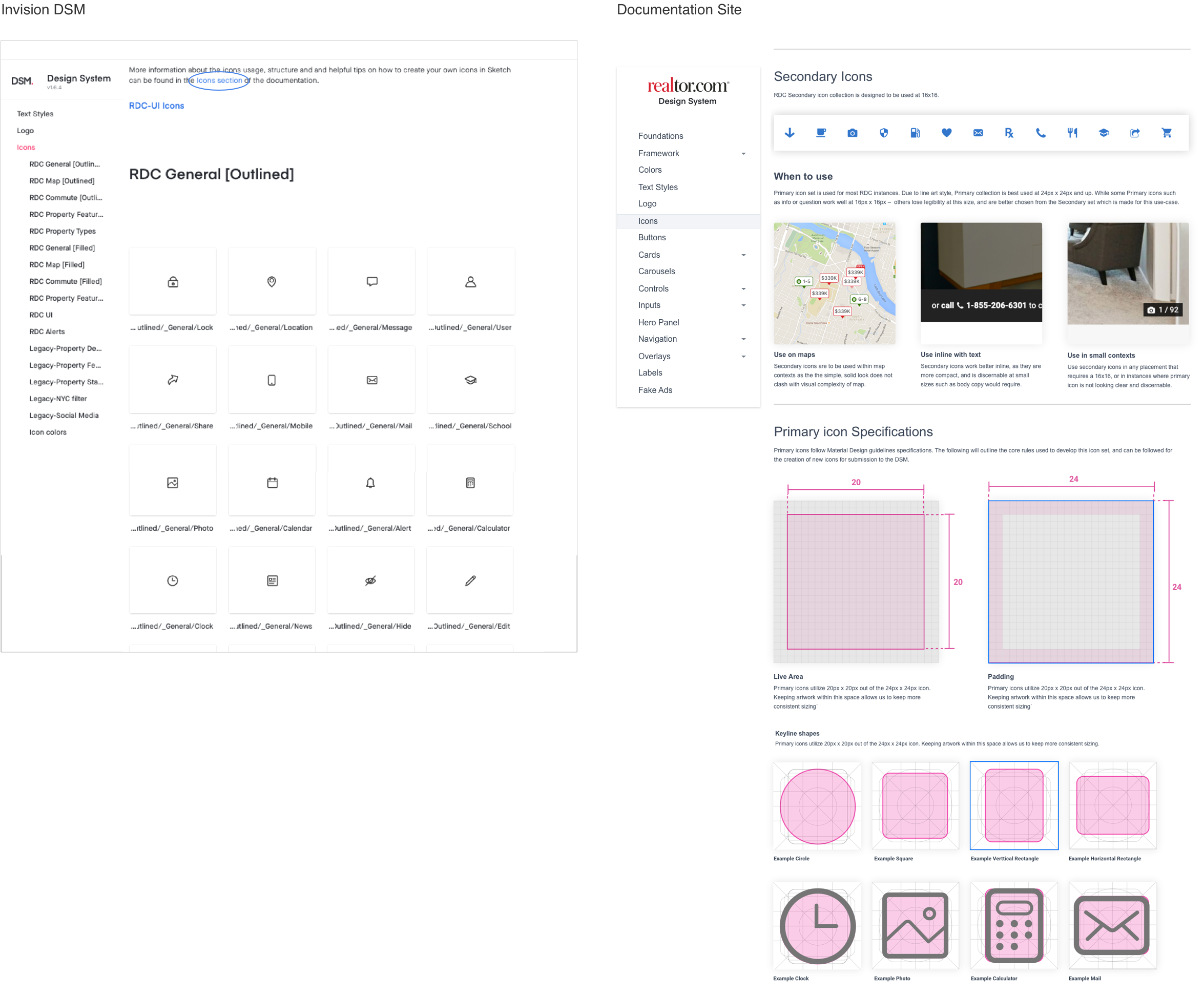
A separate website? Was it overkill?
In hindsight I don’t think so. It was a lot of work but we found that because RDC design and dev were such large organizations, the Agile process moves so quickly, and product teams are so siloed, having a single source of truth for everyone was critical for clear communication and constantly keeping people out of subjective decisions. The result is designers being able to design based off of data, which makes for happy designers. Keeping my designers out of the subjective makes it worthwhile.
Happy Designers
