300% more Leads for Veterans United
UX, CREATIVE DIRECTION, USER RESEARCH

A FRESH SYSTEM OF GUIDES TO BOOST REVENUE FOR OUR PARTNERS
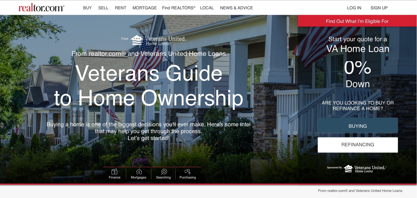
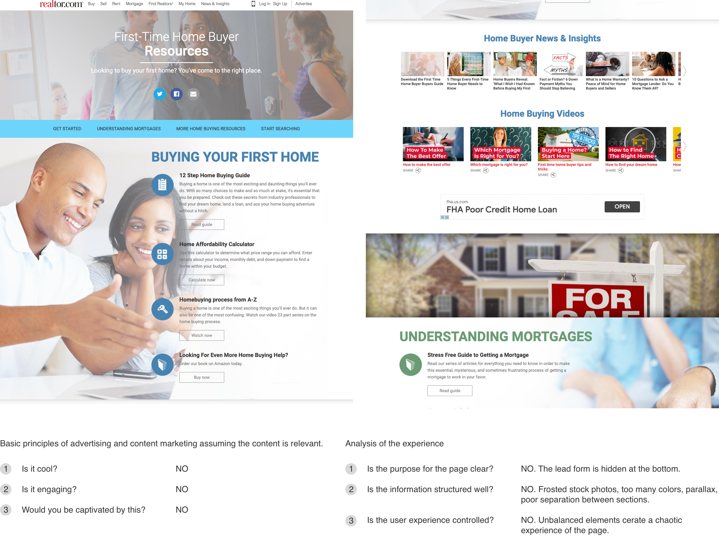
300% lift in CONVERSIONS (and I mean leads) in 6 months! Veterans United is one of RDC’s best advertising partners in the home finance space. Not only are their offerings relevant to our consumers but they are just good people to work with. RDC had been running a series of sponsored guides as a content play for a variety of advertising partners throughout the site. Consumers at the beginning part of their home buying journey would encounter the guides through SEO or by clicking in the main nav on our Realtor.com. The issue was that the conversions were low and the thus the spend wasn’t returning what it should. I will put a screenshot of a similar guide below, Not so great and you can see why it wasn’t performing. You can also clearly understand why I was chomping at the bit to work on it. It would be an easy win and it was just that.

“I need someone to explain how this whole thing works in a way that just makes sense?”
This was the most common comment in the research that we conducted and it makes sense. Home buying is totally overwhelming and people need a resource they can trust. Our first step was to find out what consumers were looking for and then begin to design around their needs.
From our research we identified several key factors that we would need to solve for.
1: Users need a resource that feels trustworthy.
2: Each aspect of the process would need to be clearly demarcated and the information presented in a way that is both easy to navigate and one that makes sense.
3: Conversion needs to be seamless.
To address these primary needs for our consumers we tried few different approaches.

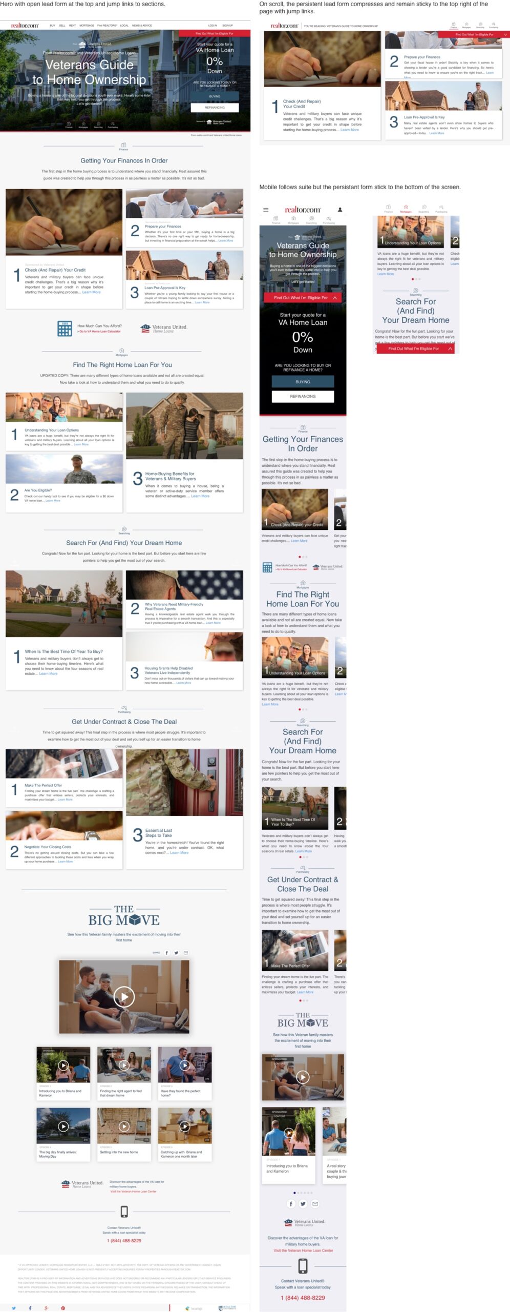
Clean design. Strong Hierarchy, Dynamic interface = 300% lift in total submitted leads in 6 months! Meaning after 6 months we had 300% more leads than the old page had in a year. This was an easy win so I don’t want to over state the challenge. But it goes to show what happens when you find out what people want and then design around those pain points.
