Design System for Realtor.com
UX, Design Systems, Design Process
Consistent, fast, and intuitive components to control the chaos of Agile.
How can designers be more consistent while still able to innovate pushing design forward? How can we efficiently make sweeping changes to both the experience and UI? And most importantly how can we do all of this in a way that doesn’t bog down our engineering brethren every time we want to change the size of a form field?
Efficiency and Consistency impact speed more than anything else.
When I arrived at Realtor.com the process for building product was bogged down to almost a stand still. Code stacks were all different based on siloed business units and teams and design differed from page to page. We were unable to release more than a few new products each quarter. The effect was widespread impacting everything from site performance to customer satisfaction on both the b2b and consumer side of the business. The worst impact was on revenue due to our inability to release new product and innovate in a manner that allowed us to keep pace with our consumers needs. After one particularly trying afternoon I sat down with a few designers, engineers and product team members and we outlined the beginnings of the 1st design system for Realtor.com. From the beginning our team was integrated including members from all of the key disciplines that build product which proved to be a critically important aspect to puling this off. A usable design system isn’t a “design thing”.
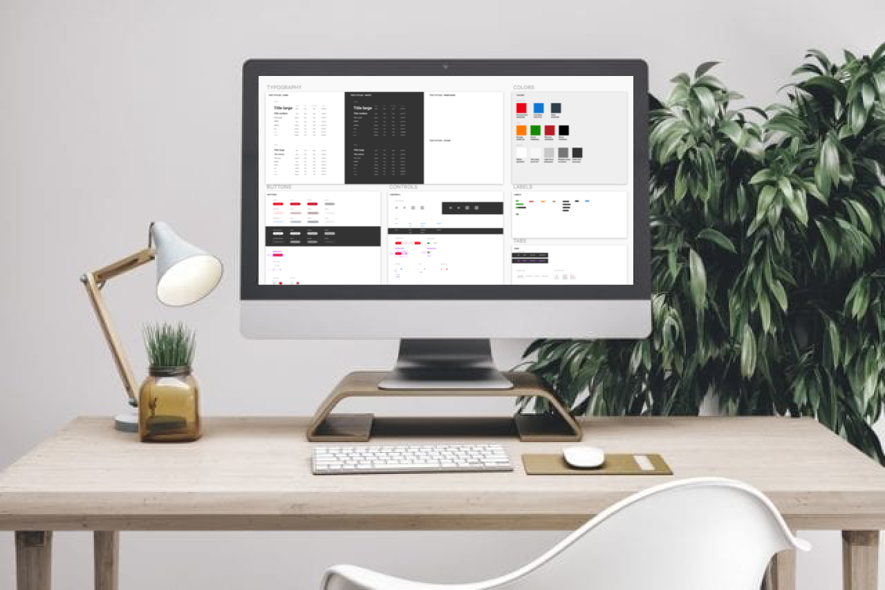
The impact was immediate and significant in terms of productivity. Not only on our side but on the engineering side as well. Here’s a few videos to demonstrate the final product.
Click on the image to see how a good design system can impact builds on the design side.
If dev can’t use the system you are dead in the water.
The most impressive aspect to today’s design system tools and the Invision DSM is the ability to attach production ready code to the components. Developers utilize storybook and the dsm to house live components essentially giving them access to the same components with the same code snippets to use across the site. Everything is linked and everything is updatable. Our release went from 2-3 new products per quarter to and entire new product line with different experiences for our consumers and b2b customers in 2 months. Start to finish. It also opened up a new revenue stream for the company earning over 50 million in the first year. We averaged 10-20 new products of varying sizes per quarter after the system was in place.
Here’s how it looks on the dev side.
We all start somewhere.
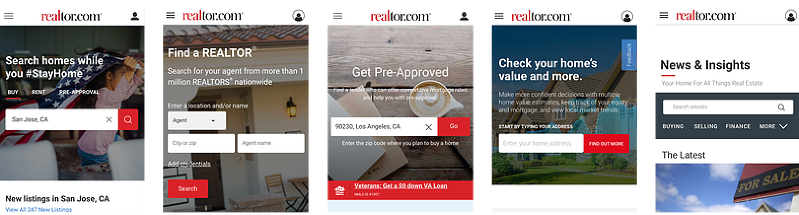
This is not consistent. The primary landing pages across the nav on RDC were all using different fonts, styles, sizes, colors, buttons and grids. But it was just the tip of the iceberg. The code reflected the same inconsistencies. In fact, an audit we found over 100 individually coded and designed modals making it impossible to update anything systematically. It was that bad.
Large problems are large opportunities!
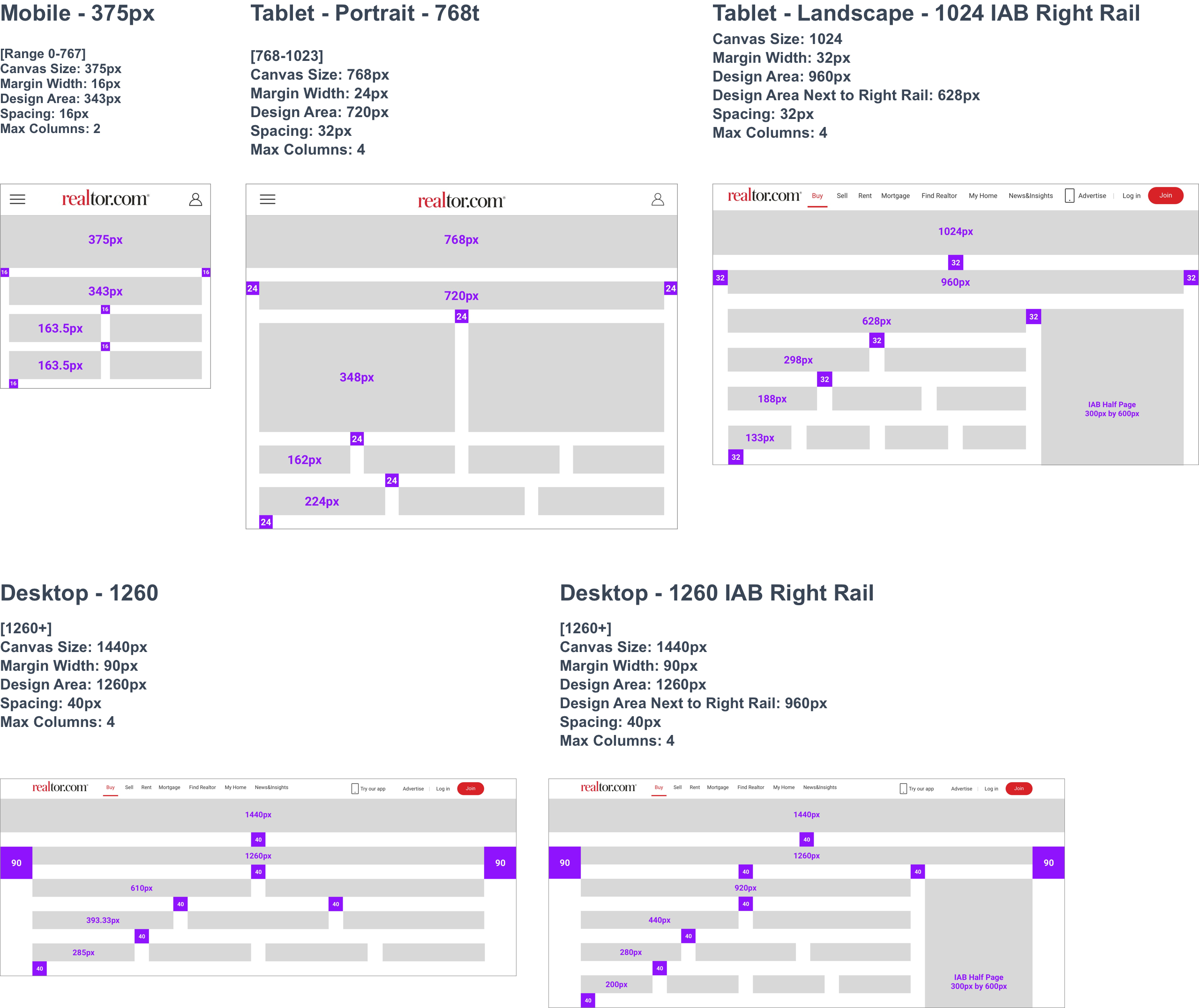
We started from the ground up with 3 basic types of grids to base or primary 3 types of pages on but soon found that the standard 12 column system wouldn’t work. There are widely different page layouts between RDC’s primary landing pages off the main nav, secondary level search result pages, and tertiary detail pages. In addition, some pages contain a right rail to accommodate 300px wide IAB Ads. A typical column-based grid forces uncomfortable trade-offs between the usable number of columns and spacing. Placing an emphasis on consistent and generous spacing within common screen sizes gives designers more flexibility to create designs which look and feel right.
Components, components components oh my.
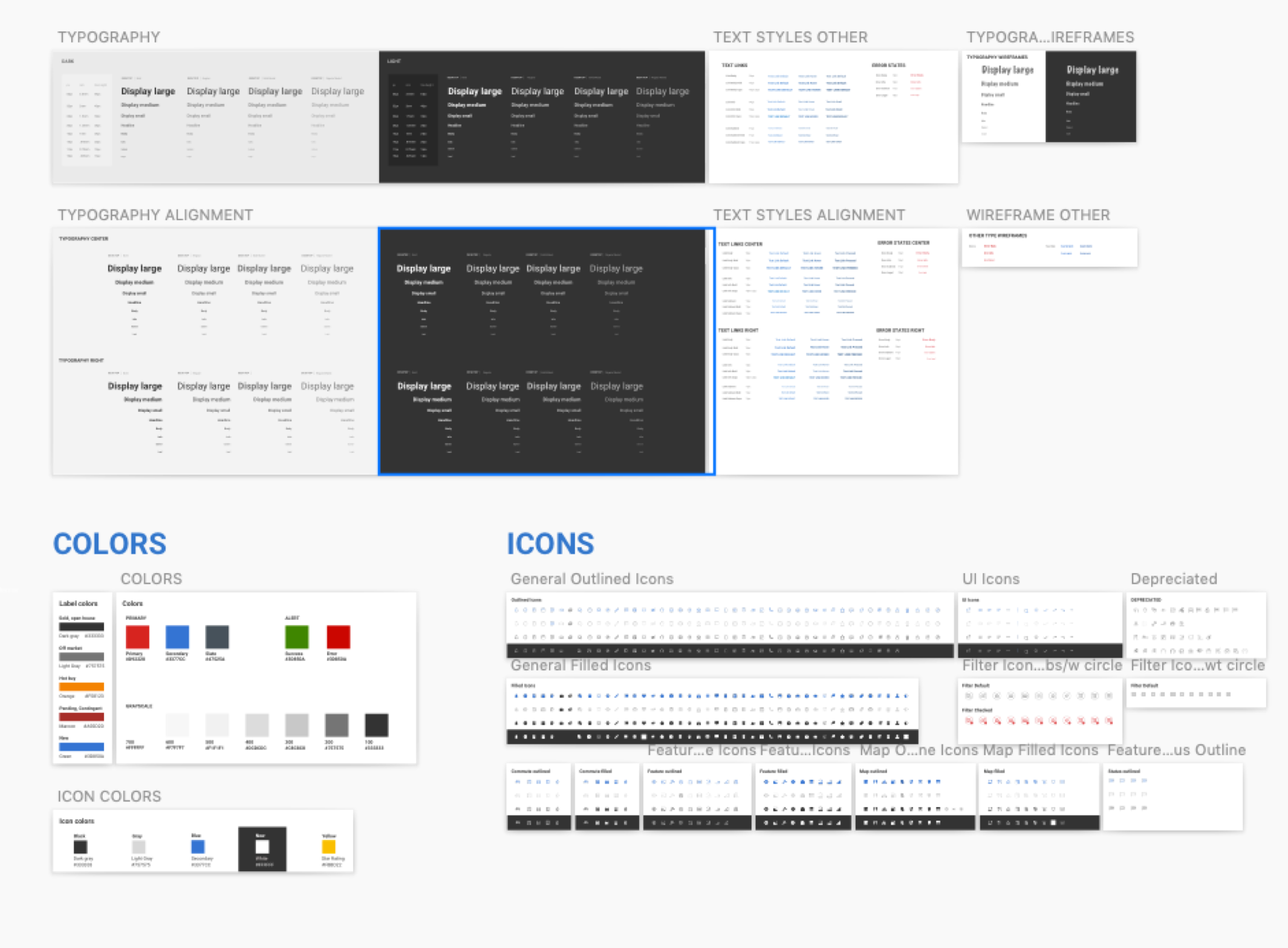
Organization of the building blacks of the system is critical we built ours based off of the Atomic system designed by Brad Frost giving designers the ability to grab pre-baked molecules / organisms or create their own utilizing atoms from within existing components. This is where our efficiency shot way up. We included wireframed versions of the components within the symbols allowing our designers to create full pages and switch from wires to UI in a matter of minutes. It was incredible.
The next step in the process was to develop a way to govern the evolution of the Design system. I’ve created a separate post detailing that process and what we learned along the way.