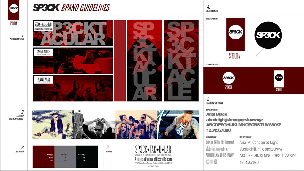
SP3CK Rebrand
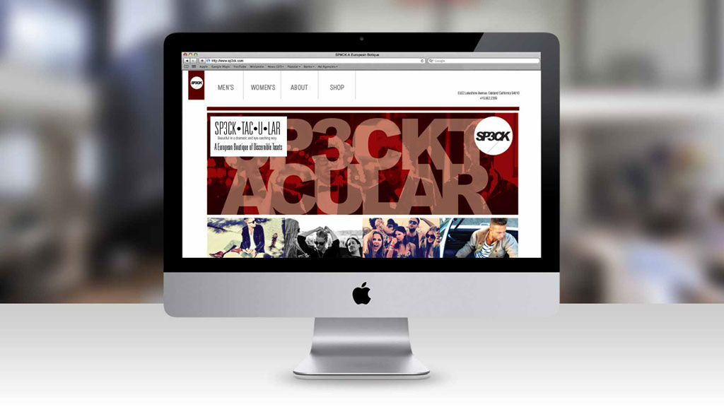
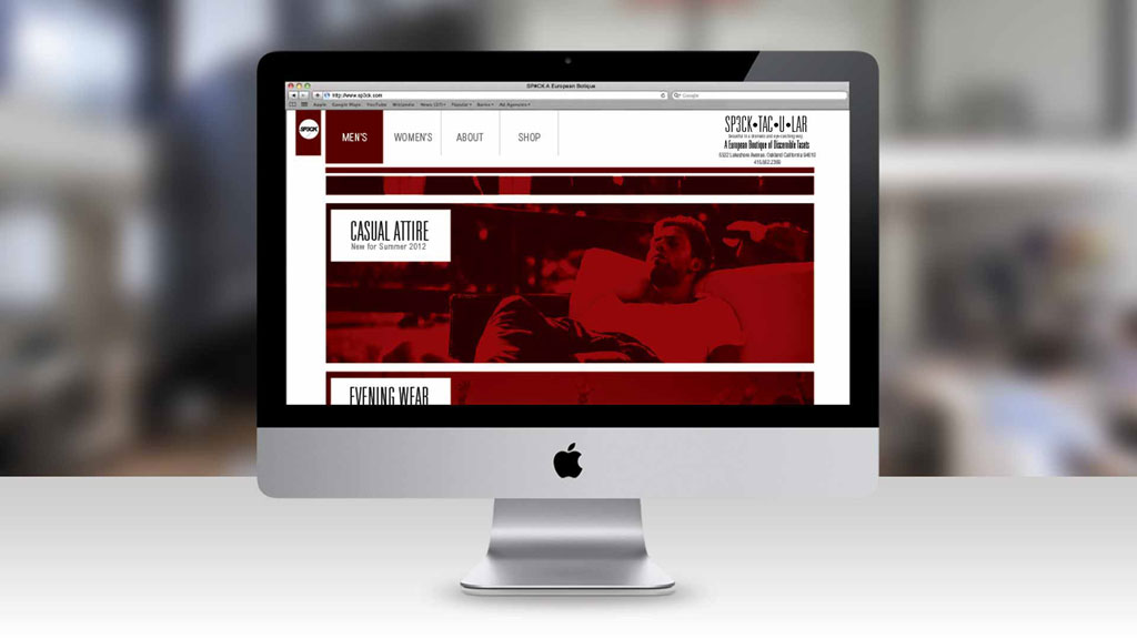
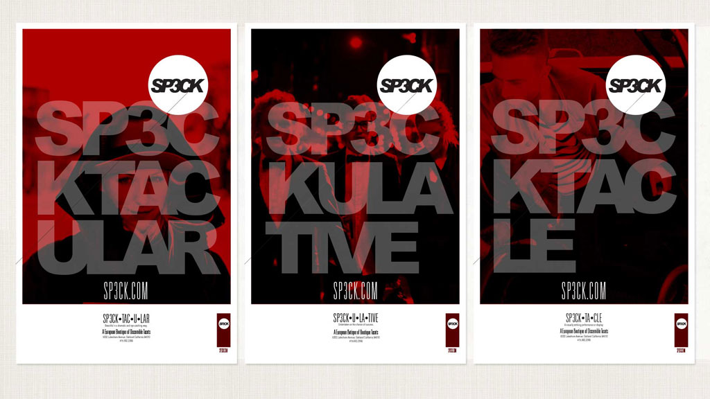
BRAND GUIDELINES, LOGO, WEB DESIGN, POSTERS, AND COLLATERAL
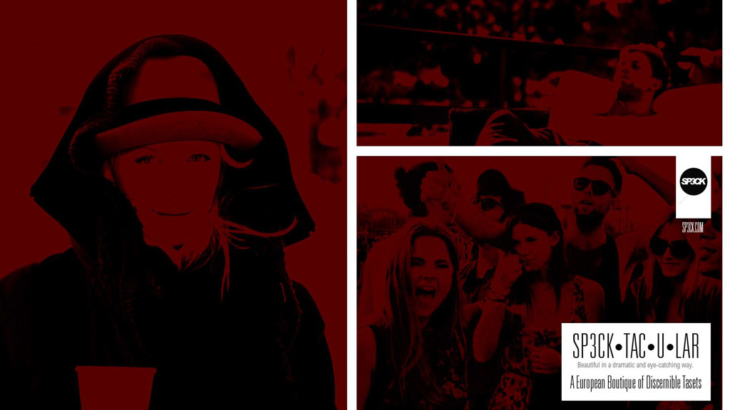
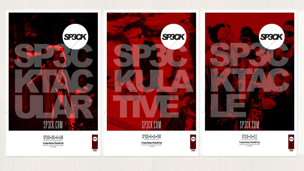
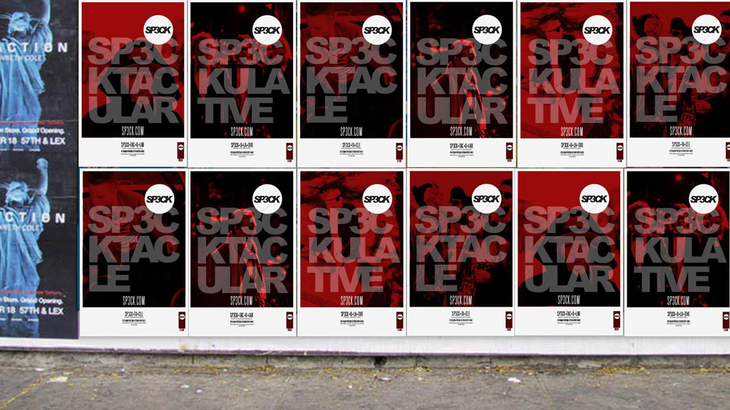
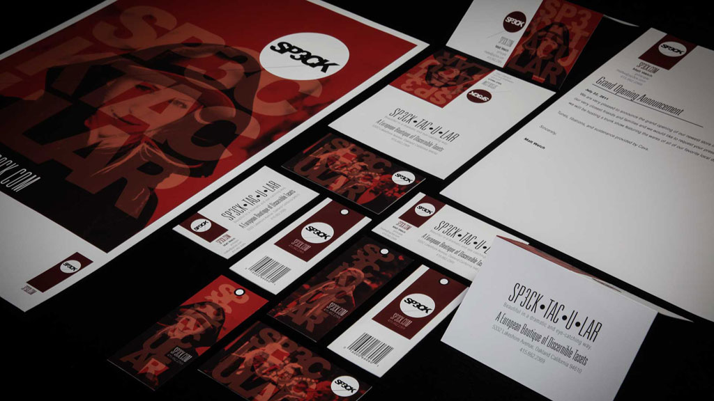
A BRAND REFRESH FOR SP3CK (SPECK). (LIKE ON THE HORIZON).
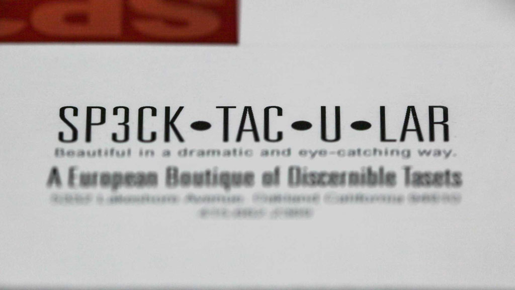
We sought to develop a dynamic brand with mixed typographic groupings and beautiful lifestyle images. The result is a sophisticated identity system. One of the most fascinating aspects of our research was the realization that the idea of a speck or a dot really falls in line with the idea of the word spectacular. Something spectacular is etched in your memory. Like a point in time. A speck. The word spectacle reiterates the same basic idea that a spectacle is the center of attention. A different sort of speck. We loved the idea of incorporating the energy behind these words into our design to add another dimension to the brand. Take a look at the work and let us know what you think.